
Rugged Romance, an Oregon Coast Elopement
- bhdpdx
- Oct 29, 2025
- 2 min read
There’s something elemental about the Oregon coast: the way weathered rock meets surf, the moss-softened timber of driftwood, the salt-kissed air that carries both wildness and quiet. When I recently created paper pieces for an elopement by the coast at Canon Beach, I let that terrain guide the design—from color palette and texture to materials and finish.
As photographer Meg Layman notes in her blog post, “The Oregon Coast is known for its moodiness, and that’s exactly what makes it so special. Whether you’re drawn to stormy skies, golden sunsets, or anything in between, an Oregon Coast elopement offers a backdrop unlike anywhere else in the world." I completely agree!


Inspiration from the Landscape
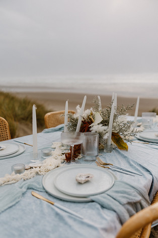
For the stationery suite, I immersed myself in the natural elements of the site. I referenced the jaggedness of the shorelines, the soft curves of oyster shells nestled in tide pools, the pale driftwood textures softened by fog and spray. I wove in shell motifs, sea-glass tones, and neutral, sand-washed papers to reflect the coast’s visual story.
The leather ribbons I chose mimicked the vibe, strong but elegant; the liner papers had subtle striations reminiscent of rock layers. The palette leaned into muted grays, bleached driftwood taupes, and hints of sea-foam green and oyster white.
Collaboration & Meaning
Meg writes that elopements are for those who believe “the best ‘venue’ is wherever the view takes your breath away”. I couldn’t agree more—and that viewpoint guided how I approached each decision: will this piece feel anchored to the moment? Will it echo the shore’s textures, the couple's warmth, the setting’s solitude?
Because when you design with intention, the paper doesn’t just say you’re invited—it says you are part of this place, this moment, this story.
Bringing It All Together
If you’re planning a coastal elopement—or any celebration shaped by nature and texture—I encourage you to let the environment lead your stationery design. Think beyond color into form, material, finish, and feel. Allow driftwood tones, oyster shell accents, rock textures, and sea-spray glints to inform the suites you send out.
Because when paper meets place, it becomes more than an invitation—it becomes an experience waiting to unfold.
Retreat: Styled Wild Retreats
Host: Meg Layman Photography
Photos: Meg Layman Photography
Styling/Florist: Oh So Brittnee
HAMUA: Marina Haynes
Ribbon: Honey Silks & Co. + EmmaLinh
Chairs: Lily and Cane
Table top rentals: Great Jones
Textiles: Emma’s Attic
Paper Goods: Letters and Dust
Suit: Jim’s Formal Wear from Manor House Bridal
Dress: Manor House Bridal
Pearl Veil: Manor House Bridal
Models: Clara Nelson & Kevin Nelson


Comments